Nordea Corporate Case study
Team of 4
I led four designers and researchers
Network of 100
100 designers used the shared design system, across Nordea's European teams
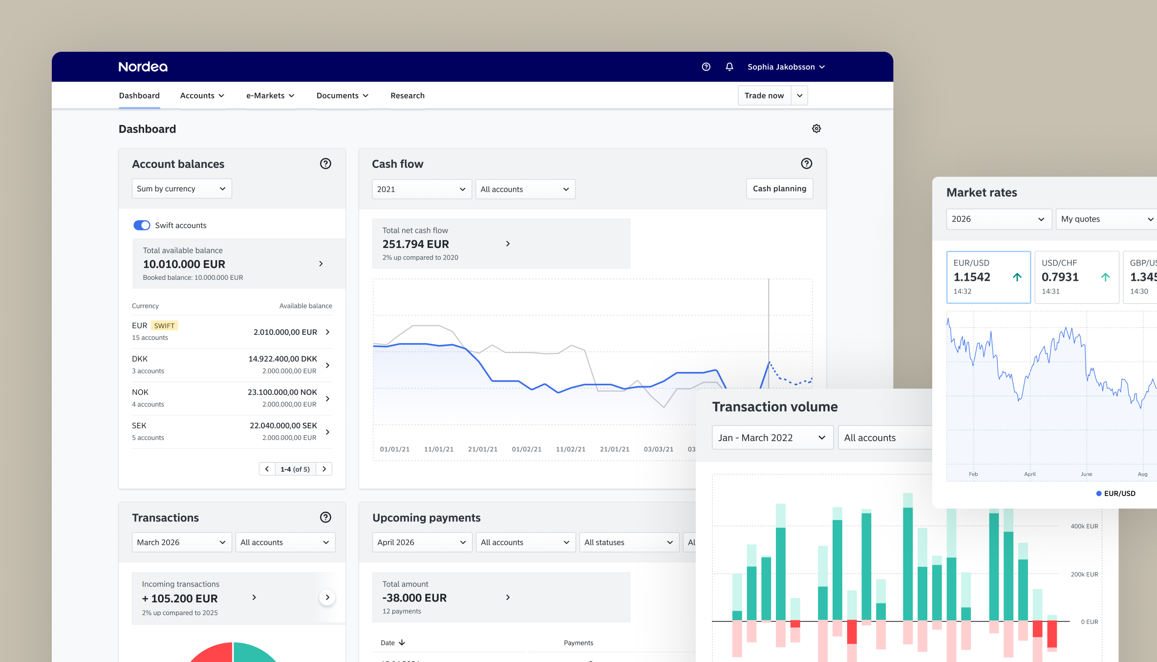
A large company's bank is rarely one thing. It's FX trading in one place, payments in another, KYC done by hand, account services somewhere else again. Each with its own login, its own logic, its own history.
For the people running finance at a company like Carlsberg, the bank wasn't a product. It was a pile of them. We built Nordea Corporate to change that.
The point was never to make one tool better. It was to build the place all of them could eventually live, and that is the work I led the UX on.
Nordea has over 1.000 digital applications for corporate customers. Figuring out the common denominators that made up the daily life of an institutional CFO was the bulk of the work.
Building the place the products would live
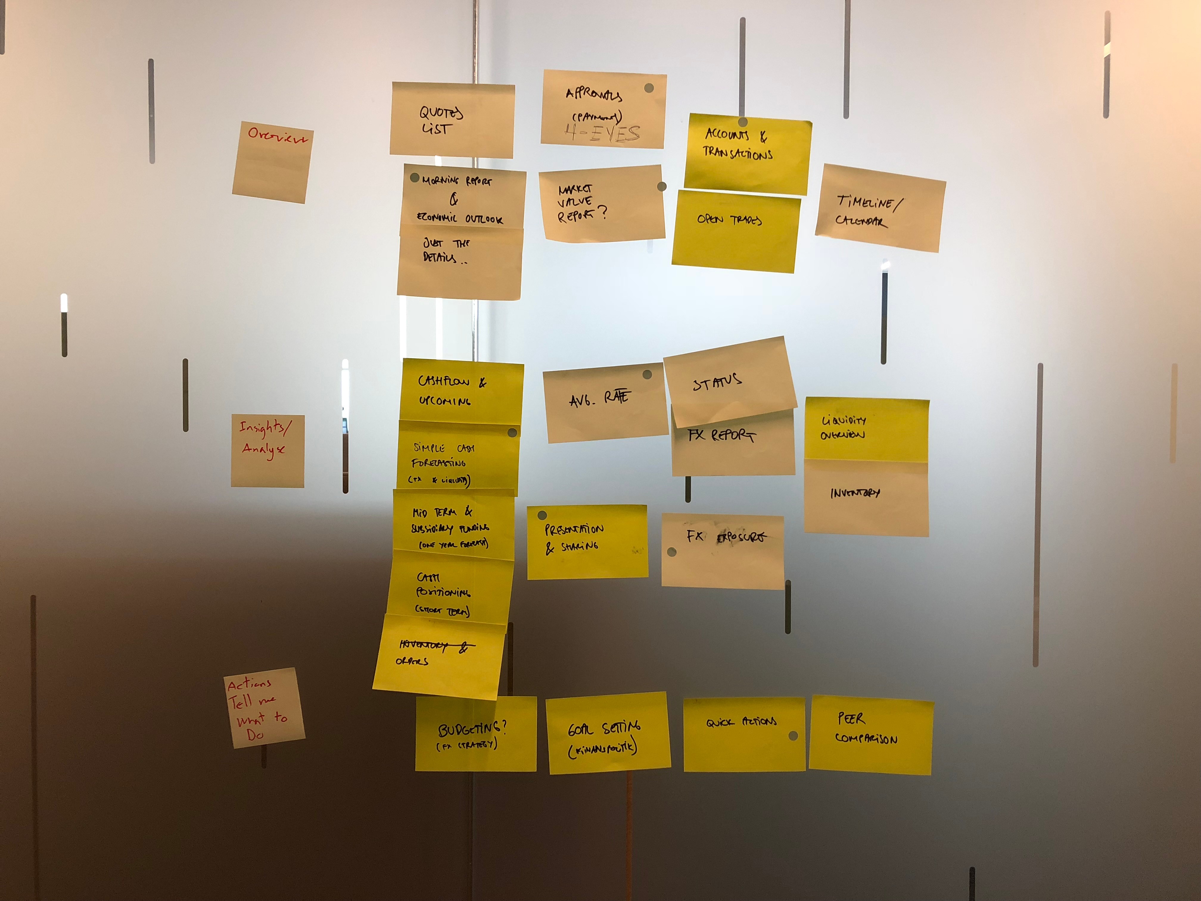
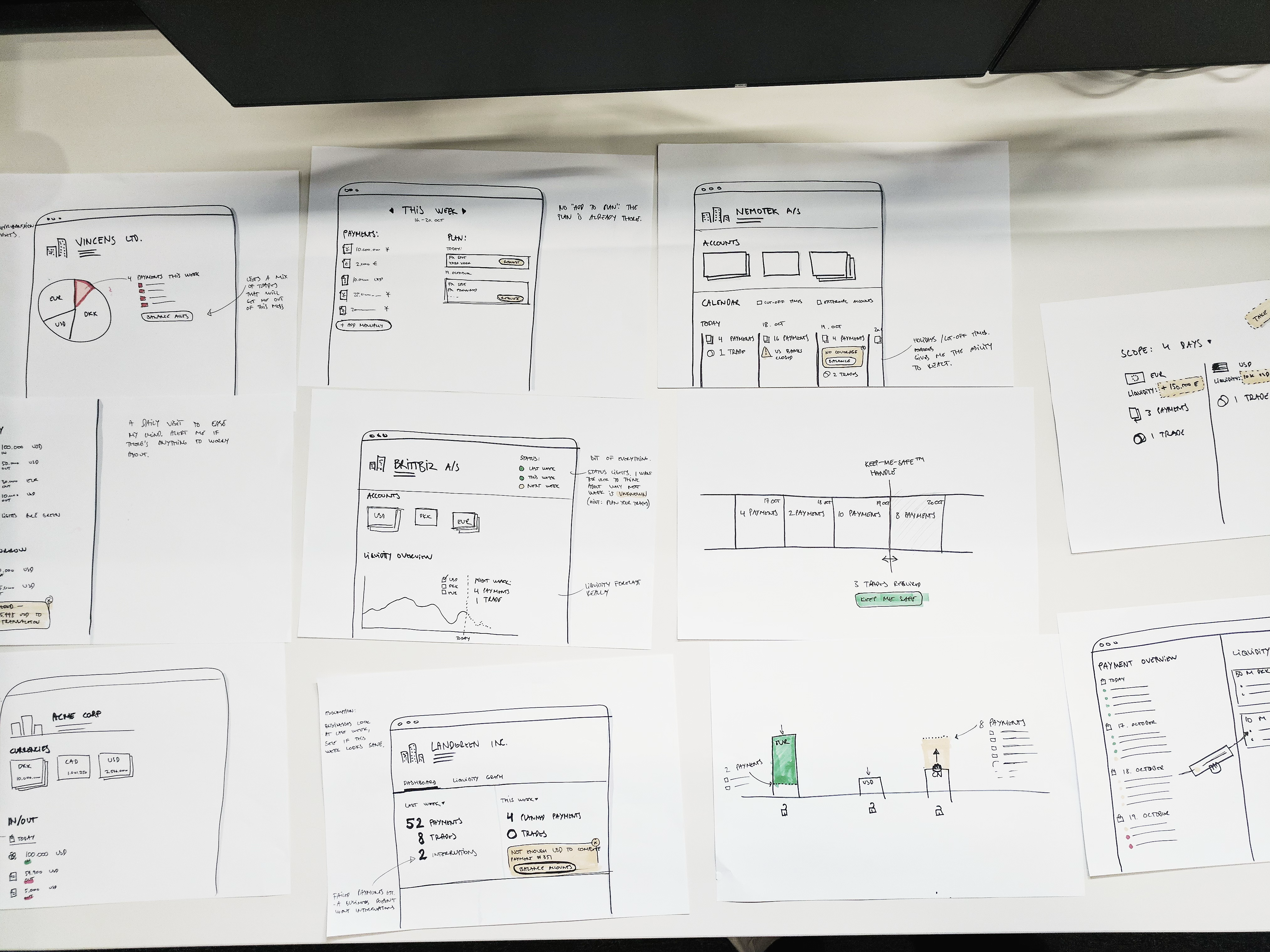
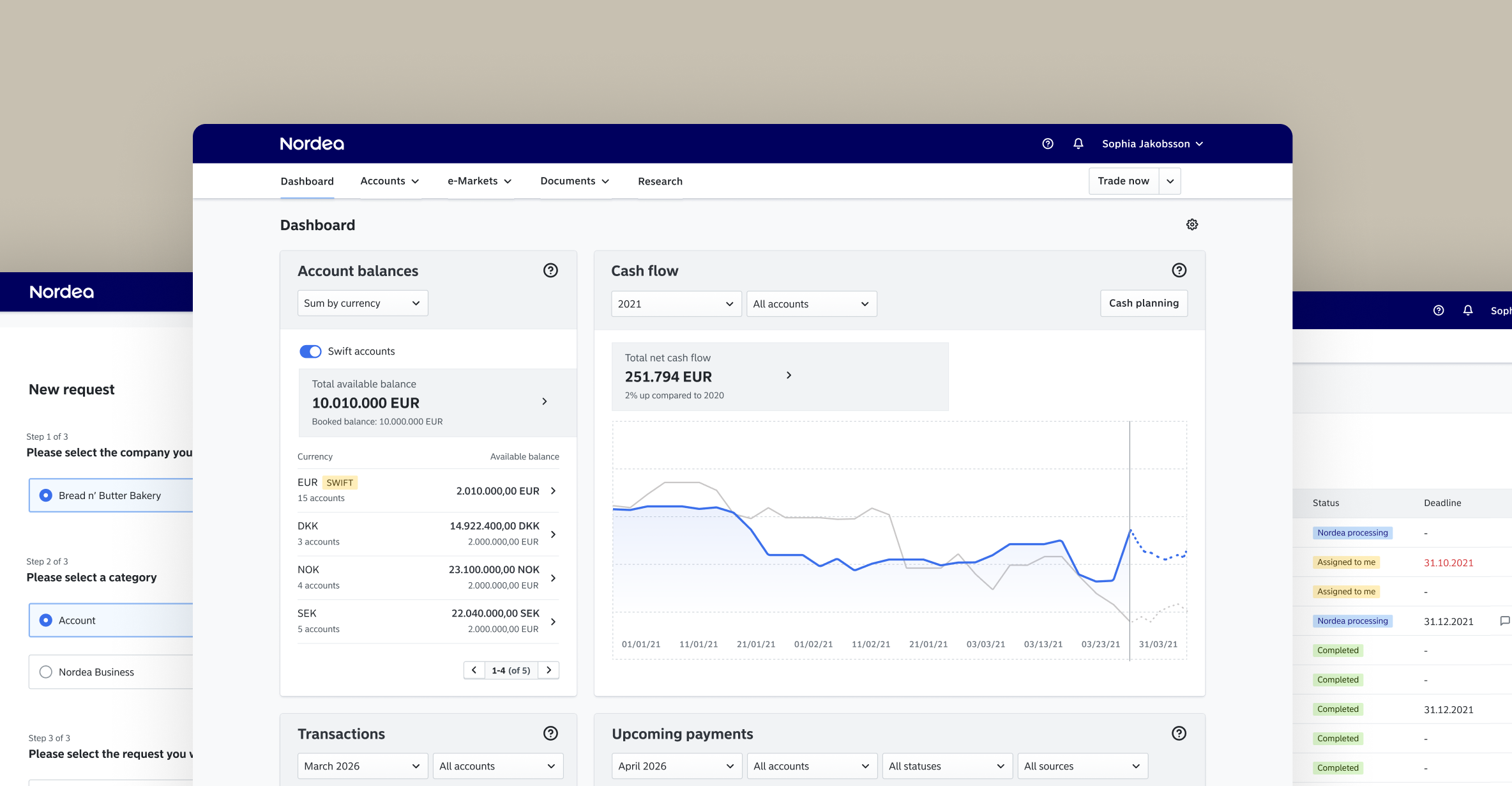
The architecture came first. The information architecture, the user journeys, the shared design system, laid down so the bank could move one process onto the platform at a time without starting from scratch every time. I ran the UX for the FX trading platform on top of that: dense, data-heavy interfaces for people making large, time-sensitive decisions routing millions through the platform every day.
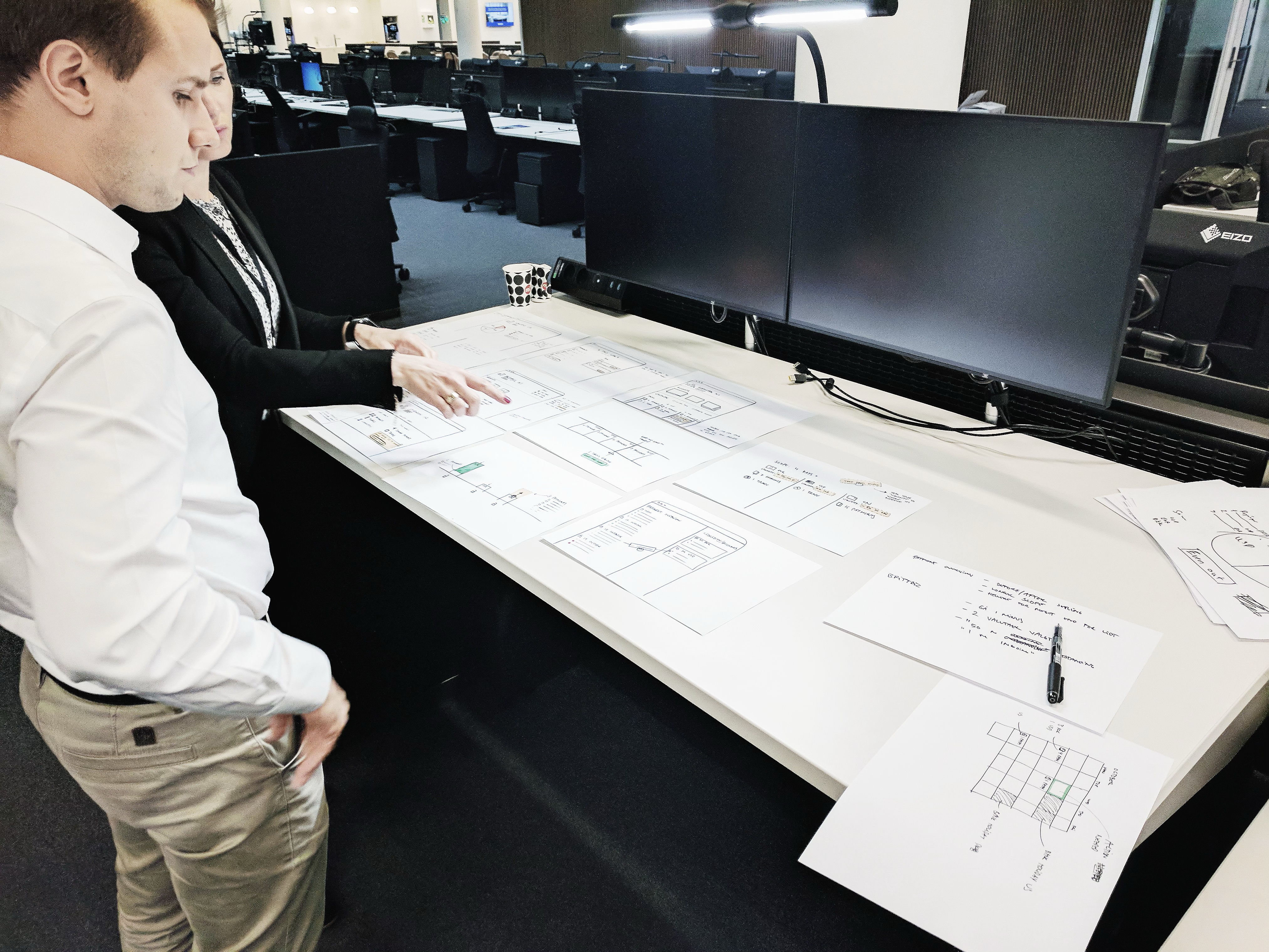
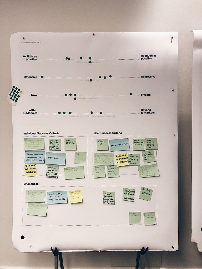
I led a team of four designers and researchers, ran discovery directly with CFOs and business owners through customer development and design sprints, and contributed to the shared design system that close to a hundred designers across Europe is working from.
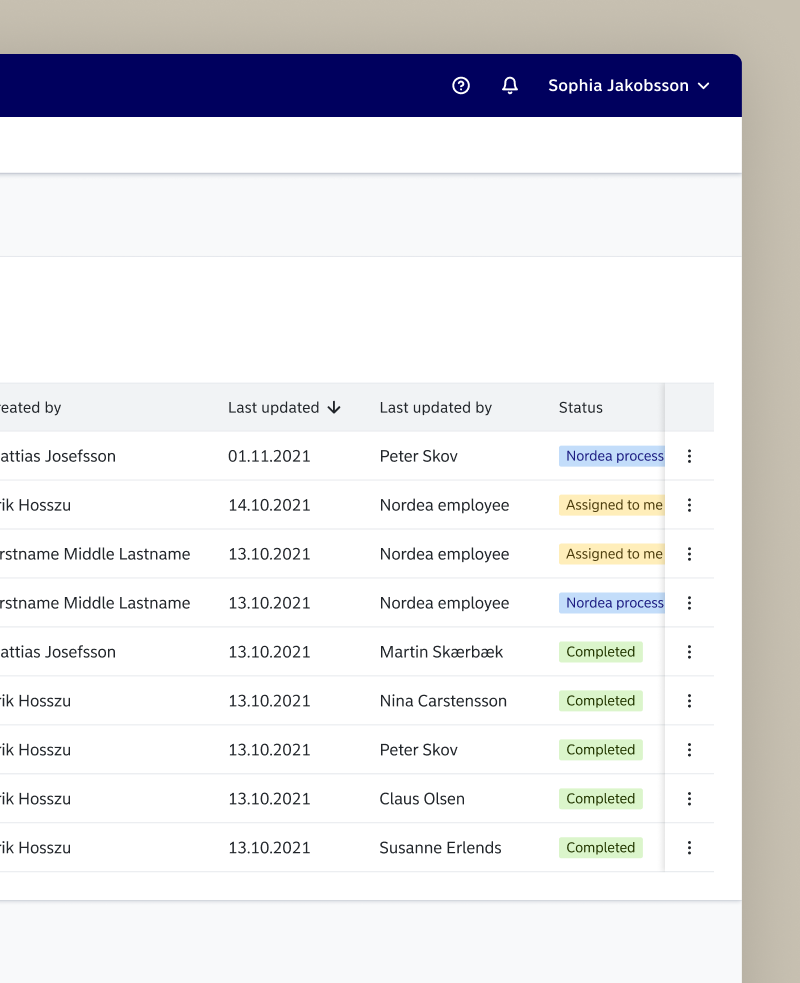
Getting all your accounts and trades in one place was the beginning. KYC was the first real proof. Onboarding a large corporate client to a bank is a compliance ordeal, historically run by hand, over email (and yes, fax too), by people. We digitalised it. It became one of the first heavy, regulated processes to move onto the platform and actually feel lighter to the client, and more importantly, it solved massive headaches internally.
Banking is genuinely hard
Nordea's products are scattered by years of history. The recurring tension wasn't visual or technical. It was translation. What a CFO asked for was often not buildable, not because the design was wrong, but because the underlying products didn't bend that way. Designing journeys that served what users were actually trying to do, across products that were never built to cooperate, meant constant tradeoffs.
The interface was only ever part of the answer. Adoption couldn't happen on the design alone, so we worked much more closely with marketing and with the bank's customer advisers, the people sitting across from these clients, to bring users into the new way of working. The product is rarely just the product. It's the activity around it, and on a platform this size that activity is most of the work.
I worked directly with clients like Carlsberg and the Finnish state on the actual flows. Having the people who'd live in these journeys in the room is rare in a bank that size, and it's the part of the work I valued most.
Nordea Corporate became the backbone of the bank's offering to its largest corporate clients. The architecture held. Processes kept moving onto it after I left, which is the only real test of whether you built a platform or just another product.
What started as scattered tools and paper became a single home, one login, one coherent place, for the companies that matter most to the bank. The interface was part of that. The part I'm proudest of is the thing the interface sat on, and the work around it that made anyone actually use it.
Nordea Corporate Case study
One home for the bank's hardest customers. Taking large corporates from scattered tools and paper-based KYC to a single platform across FX trading, payments and compliance.
Network of 100
100 designers used the shared design system, across Nordea's European teams
Team of 4
I led four designers and researchers
A large company's bank is rarely one thing. It's FX trading in one place, payments in another, KYC done by hand, account services somewhere else again. Each with its own login, its own logic, its own history.
For the people running finance at a company like Carlsberg, the bank wasn't a product. It was a pile of them. We built Nordea Corporate to change that.
The point was never to make one tool better. It was to build the place all of them could eventually live, and that is the work I led the UX on.
Nordea has over 1.000 digital applications for corporate customers. Figuring out the common denominators that made up the daily life of an institutional CFO was the bulk of the work.
Building the place the products would live
The architecture came first. The information architecture, the user journeys, the shared design system, laid down so the bank could move one process onto the platform at a time without starting from scratch every time. I ran the UX for the FX trading platform on top of that: dense, data-heavy interfaces for people making large, time-sensitive decisions routing millions through the platform every day.
I led a team of four designers and researchers, ran discovery directly with CFOs and business owners through customer development and design sprints, and contributed to the shared design system that close to a hundred designers across Europe is working from.
Getting all your accounts and trades in one place was the beginning. KYC was the first real proof. Onboarding a large corporate client to a bank is a compliance ordeal, historically run by hand, over email (and yes, fax too), by people. We digitalised it. It became one of the first heavy, regulated processes to move onto the platform and actually feel lighter to the client, and more importantly, it solved massive headaches internally.
Banking is genuinely hard
Nordea's products are scattered by years of history. The recurring tension wasn't visual or technical. It was translation. What a CFO asked for was often not buildable, not because the design was wrong, but because the underlying products didn't bend that way. Designing journeys that served what users were actually trying to do, across products that were never built to cooperate, meant constant tradeoffs.
The interface was only ever part of the answer. Adoption couldn't happen on the design alone, so we worked much more closely with marketing and with the bank's customer advisers, the people sitting across from these clients, to bring users into the new way of working. The product is rarely just the product. It's the activity around it, and on a platform this size that activity is most of the work.
I worked directly with clients like Carlsberg and the Finnish state on the actual flows. Having the people who'd live in these journeys in the room is rare in a bank that size, and it's the part of the work I valued most.
Nordea Corporate became the backbone of the bank's offering to its largest corporate clients. The architecture held. Processes kept moving onto it after I left, which is the only real test of whether you built a platform or just another product.
What started as scattered tools and paper became a single home, one login, one coherent place, for the companies that matter most to the bank. The interface was part of that. The part I'm proudest of is the thing the interface sat on, and the work around it that made anyone actually use it.
Nordea Corporate Case study
One home for the bank's hardest customers. Taking large corporates from scattered tools and paper-based KYC to a single platform across FX trading, payments and compliance.
Team of 4
I led four designers and researchers
Network of 100
100 designers used the shared design system, across Nordea's European teams
A large company's bank is rarely one thing. It's FX trading in one place, payments in another, KYC done by hand, account services somewhere else again. Each with its own login, its own logic, its own history.
For the people running finance at a company like Carlsberg, the bank wasn't a product. It was a pile of them. We built Nordea Corporate to change that.
The point was never to make one tool better. It was to build the place all of them could eventually live, and that is the work I led the UX on.
Nordea has over 1.000 digital applications for corporate customers. Figuring out the common denominators that made up the daily life of an institutional CFO was the bulk of the work.
Building the place the products would live
The architecture came first. The information architecture, the user journeys, the shared design system, laid down so the bank could move one process onto the platform at a time without starting from scratch every time. I ran the UX for the FX trading platform on top of that: dense, data-heavy interfaces for people making large, time-sensitive decisions routing millions through the platform every day.
I led a team of four designers and researchers, ran discovery directly with CFOs and business owners through customer development and design sprints, and contributed to the shared design system that close to a hundred designers across Europe is working from.
Getting all your accounts and trades in one place was the beginning. KYC was the first real proof. Onboarding a large corporate client to a bank is a compliance ordeal, historically run by hand, over email (and yes, fax too), by people. We digitalised it. It became one of the first heavy, regulated processes to move onto the platform and actually feel lighter to the client, and more importantly, it solved massive headaches internally.
Banking is genuinely hard
Nordea's products are scattered by years of history. The recurring tension wasn't visual or technical. It was translation. What a CFO asked for was often not buildable, not because the design was wrong, but because the underlying products didn't bend that way. Designing journeys that served what users were actually trying to do, across products that were never built to cooperate, meant constant tradeoffs.
The interface was only ever part of the answer. Adoption couldn't happen on the design alone, so we worked much more closely with marketing and with the bank's customer advisers, the people sitting across from these clients, to bring users into the new way of working. The product is rarely just the product. It's the activity around it, and on a platform this size that activity is most of the work.
I worked directly with clients like Carlsberg and the Finnish state on the actual flows. Having the people who'd live in these journeys in the room is rare in a bank that size, and it's the part of the work I valued most.
Nordea Corporate became the backbone of the bank's offering to its largest corporate clients. The architecture held. Processes kept moving onto it after I left, which is the only real test of whether you built a platform or just another product.
What started as scattered tools and paper became a single home, one login, one coherent place, for the companies that matter most to the bank. The interface was part of that. The part I'm proudest of is the thing the interface sat on, and the work around it that made anyone actually use it.